Understanding and Utilizing a Color Wheel for Effective Design
EDUCATIONAL
1/28/20242 min read
Introduction
In the world of design, color plays a crucial role in conveying emotions, creating visual impact, and enhancing overall aesthetics. To effectively work with colors, it is essential to understand the principles of color theory and how to use a color wheel. In this article, we will explore the basics of the color wheel and provide instructions on how to utilize it for your design projects.
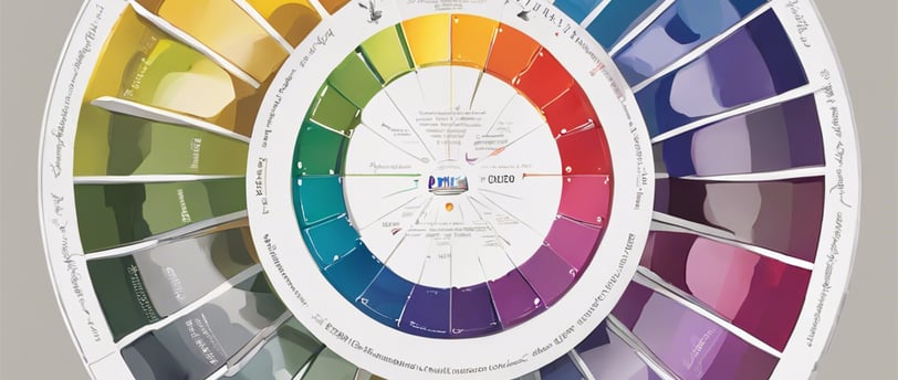
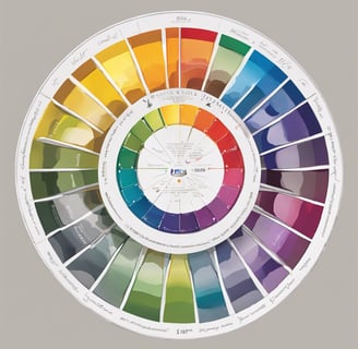
What is a Color Wheel?
A color wheel is a visual representation of the relationships between different colors. It consists of a circular arrangement of colors, showcasing primary, secondary, and tertiary colors. The color wheel helps designers understand color harmony, contrast, and the effects of different color combinations.
Primary Colors
The color wheel starts with the primary colors: red, blue, and yellow. These colors cannot be created by mixing other colors together and are the building blocks for all other colors.
Secondary Colors
By mixing equal parts of two primary colors, we create secondary colors. The secondary colors are green (mixing yellow and blue), purple (mixing red and blue), and orange (mixing red and yellow).
Tertiary Colors
Tertiary colors are created by mixing a primary color with a neighboring secondary color. For example, mixing red and orange creates a reddish-orange color. The tertiary colors expand the color palette, allowing for more nuanced combinations.
Color Relationships
Understanding the relationships between colors is crucial for creating visually appealing designs. The color wheel helps us identify complementary colors, analogous colors, and triadic colors.
Complementary Colors
Complementary colors are located directly opposite each other on the color wheel. When used together, they create a high-contrast and vibrant effect. For example, red and green are complementary colors.
Analogous Colors
Analogous colors are located next to each other on the color wheel. They create a harmonious and cohesive look when used together. For instance, blue, green, and teal are analogous colors.
Triadic Colors
Triadic colors are evenly spaced around the color wheel, forming a triangle. They provide a balanced and dynamic color scheme. An example of a triadic color scheme would be using red, yellow, and blue together.
Using the Color Wheel
Now that you understand the basics of the color wheel, here are a few steps to effectively utilize it:
Identify the primary color you want to work with.
Choose a color relationship: complementary, analogous, or triadic.
Select the corresponding colors from the color wheel.
Experiment with different shades, tints, and tones of the chosen colors to add depth and variation.
Apply the color scheme to your design project, considering the mood, purpose, and target audience.
Remember, the color wheel is a tool to guide your color choices, but creativity and personal preferences should also be considered. Experimentation and practice will help you develop an eye for effective color combinations.
Conclusion
The color wheel is an invaluable resource for artists, providing a visual guide to understanding color relationships and creating harmonious designs. By applying the principles of color theory and utilizing the color wheel, you can elevate your design projects and evoke the desired emotions and responses from your audience.